
Functional and aesthetic concerns are at the basis of a design process, especially for publications of mass communication—where aesthetic choices can also reflect political orientations. For this printed format, the goal is to produce a form that communicates the textual content while engaging the audience on a visual level.
In the early 20th century in Egypt, there was no shortage of politically oriented periodicals, and one of the weekly magazines—which was initially published as al-Kachkūl al-muṣawwar (The Illustrated Notebook)—can be used to analyze and chart the historical conditions of the Egyptian society at the time: the extent to which the press was free, how print media developed over this period, and formal and editorial design and typographic trends, as well as the wider social and political context of a community undergoing intense historical changes.
History of the magazine’s founding and founder
Sulaymān Fawzī, a politician and businessman and the owner and publisher of Al Kachkoul, had initially launched a publication with a similar title and started distributing the illustrated journal to subscribers together with the first publication in September 1921. Fawzī, a seasoned newspaper person, also owned Assaghr, a more traditionally formatted political daily newspaper that published news and statistics and was printed in black and white using letterpress printing. Both Al Kachkoul and Assaghr professed strong anti-Wafdist (Al Wafd was a political party that demanded the immediate end of the British occupation of Egypt) sentiments which, according to the official British Foreign Office reports, was presumably in the interest of Wafdist dissidents. This position was seen to be so central to the identity of the publication that a British analyst here explicitly connects them both: “His wretched daily newspaper, the Thaghr (sic), has been resurrected to serve the same purpose” (internet archive 2023).
Many satirical publications flourished between 1900 and 1950, and were generally highly political, sometimes offering compelling forms of anti-colonial resistance—mostly against the British occupation—which led to many of them being shut down or their owners imprisoned, exiled, or even subjected to assassination attempts in retaliation. Even Sulaymān Fawzī, who was a friend of the British, had his fair share of such types of incidents including a fire in the publication headquarters and more than one instance of imprisonment pending trial.

Al Kachkoul acted as a record of the social and political situation in Egypt in the period following the 1919 Revolution, offering subscribers weekly updates on state affairs and both local and international politics, as well as publishing poems, essays, opinion pieces, advertisements, and various other entries, including their signature satirical illustrations depicting and commenting on Egypt’s multilayered social fabric between the 1920s and the 1930s. Though lively and colorful, the publication was also tone-deaf, racist, biased, and prone to personalized barbed attacks against its political opponents.
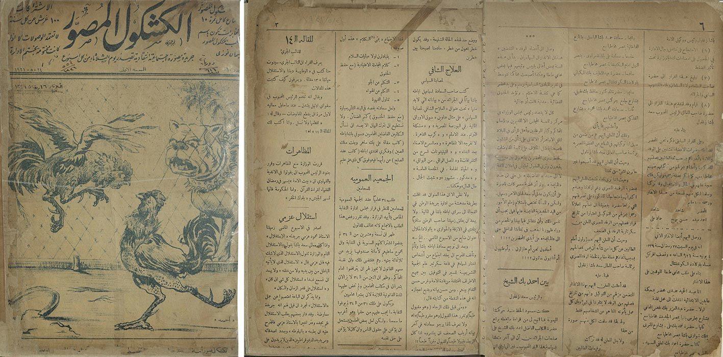
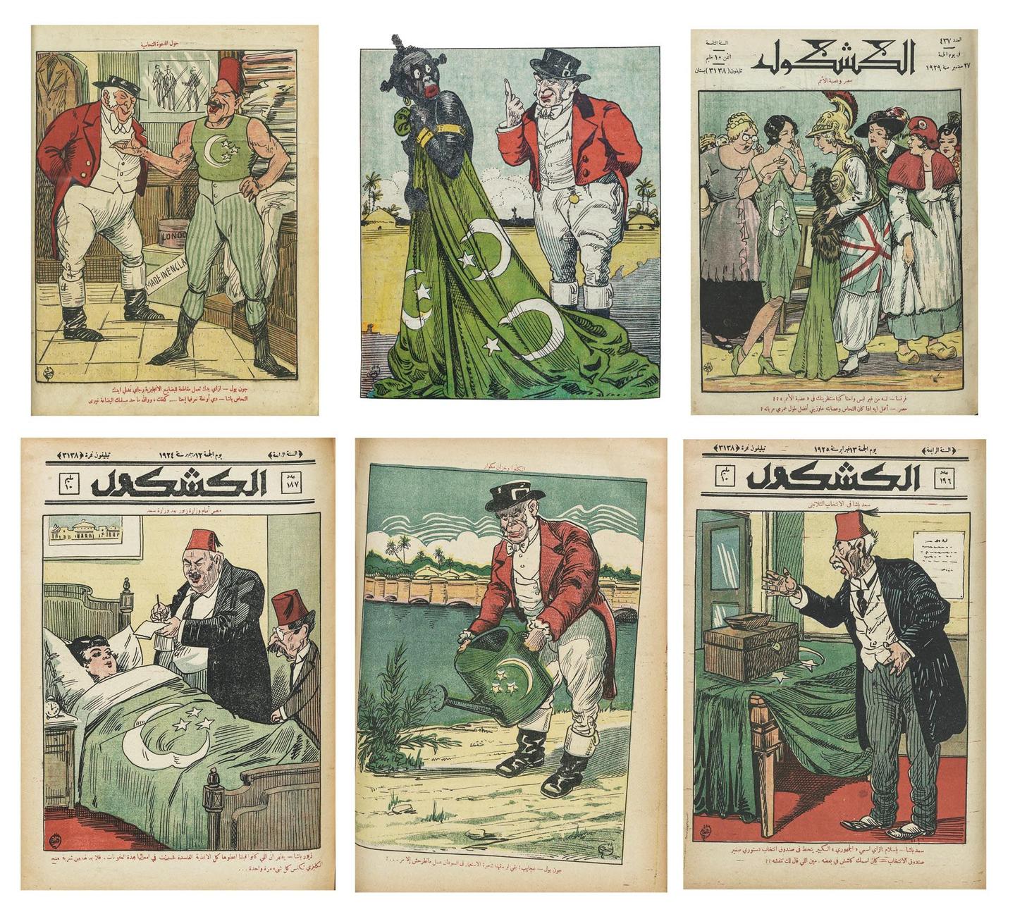
Al Kachkoul, which means a stack of paper collected using a heavier paper cover, was composed of typeset pages of news, articles, and advertisements, printed using black ink interspersed with striking full-page color illustrations printed using stone lithography. Initially launched as a four-page folio, it continued to expand over the years first to 16 pages, then by its ninth year to 28 pages, before reaching its maximum length of 36 pages toward the end of their 11th year.
An overwhelming amount of work went into this weekly production, from written coverage to elaborate illustrations. An editorial note on the first page of issue 544 (October 1931) outlines the continuous development of the publication since its launch, in terms of the increase in the number of illustrations, the addition of photographic images, and the usage of rotary printing press which at the time was cutting-edge.
The publication was quite vague about its contributors; an impressum was not included, and only the proprietor’s name was printed on the cover page, as random employees and other acquaintances of the proprietor were usually commissioned to write the pieces (Abdel Naeem 2023). Almost none of the articles were signed, and no information was provided on the authors. However, every illustration was signed, at least until 1929 when the practice stopped with the departure of the magazine’s main illustrator Juan Sintès.
All vivid illustrations functioned as standalone pieces and did not accompany the magazine’s articles or essays; the only text used was integrated with the illustration—such as the title of the piece, and often a couple of lines of commentary or conversation between the illustrated characters below the printing plate, written in colloquial Arabic. The illustrations were central to the publication’s identity and content.
Though politically conservative, it showed spontaneity and adaptability in its visual identity. Al Kachkoul went through a number of visual changes and was to a great extent formally experimental. Even though printed using heavy slabs of stone, it remained dynamic and flexible, changing the masthead and design of the header, the layout of the cover pages, subtitle font, and illustration style many times over the span of its existence.
Historical and political context
The nationalist-driven Wafd Party came into existence in the aftermath of World War I, and the party’s main goal was the immediate end of the British occupation of Egypt. The party was heavily involved in the popular uprising of 1919 which culminated with the formal declaration of the end of the British Protectorate in 1922, soon after which the Wafd Party, under the leadership of Saad Zaghloul, were invited to form a government. The elections of January 12, 1924 gave the Wafd Party an overwhelming majority, and two weeks later, Zaghloul formed the first Wafdist government. Zaghloul—the first popularly elected Prime Minister—remained a powerful figure in Egyptian politics until his death in 1927.
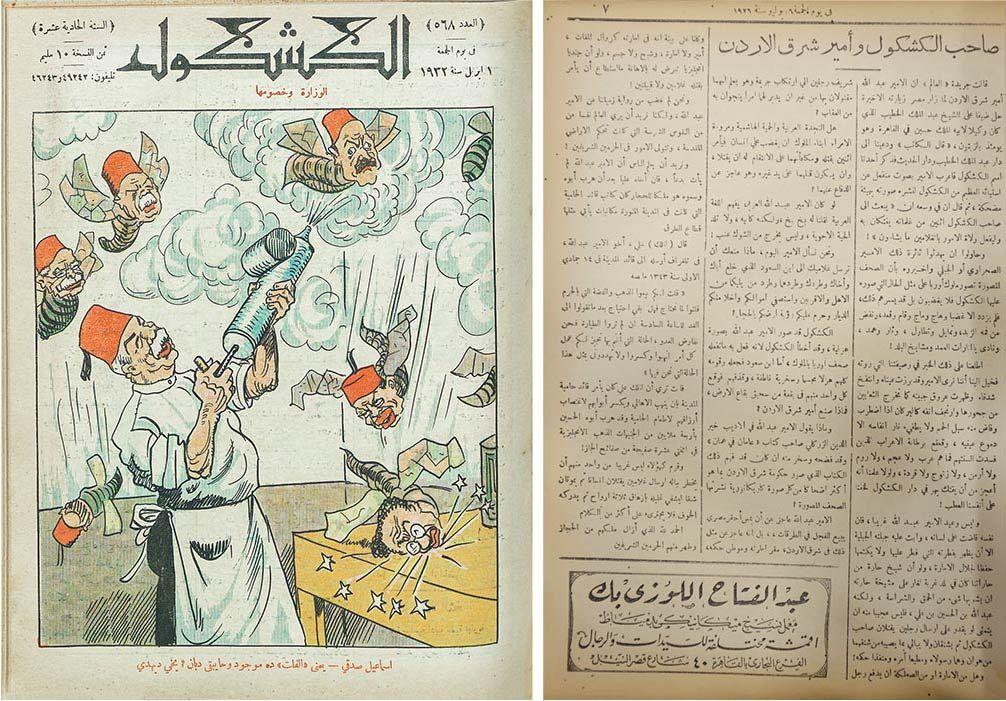
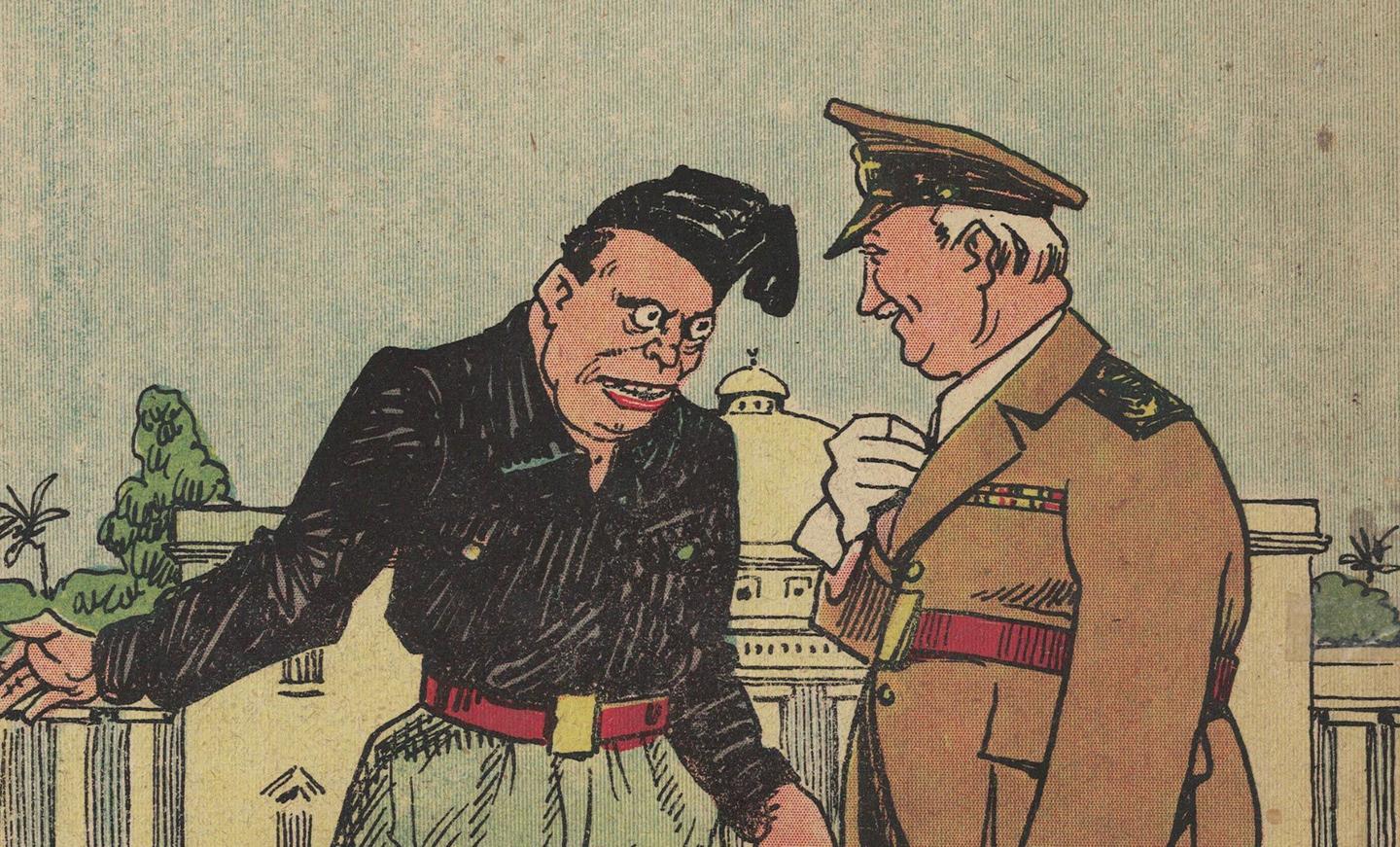
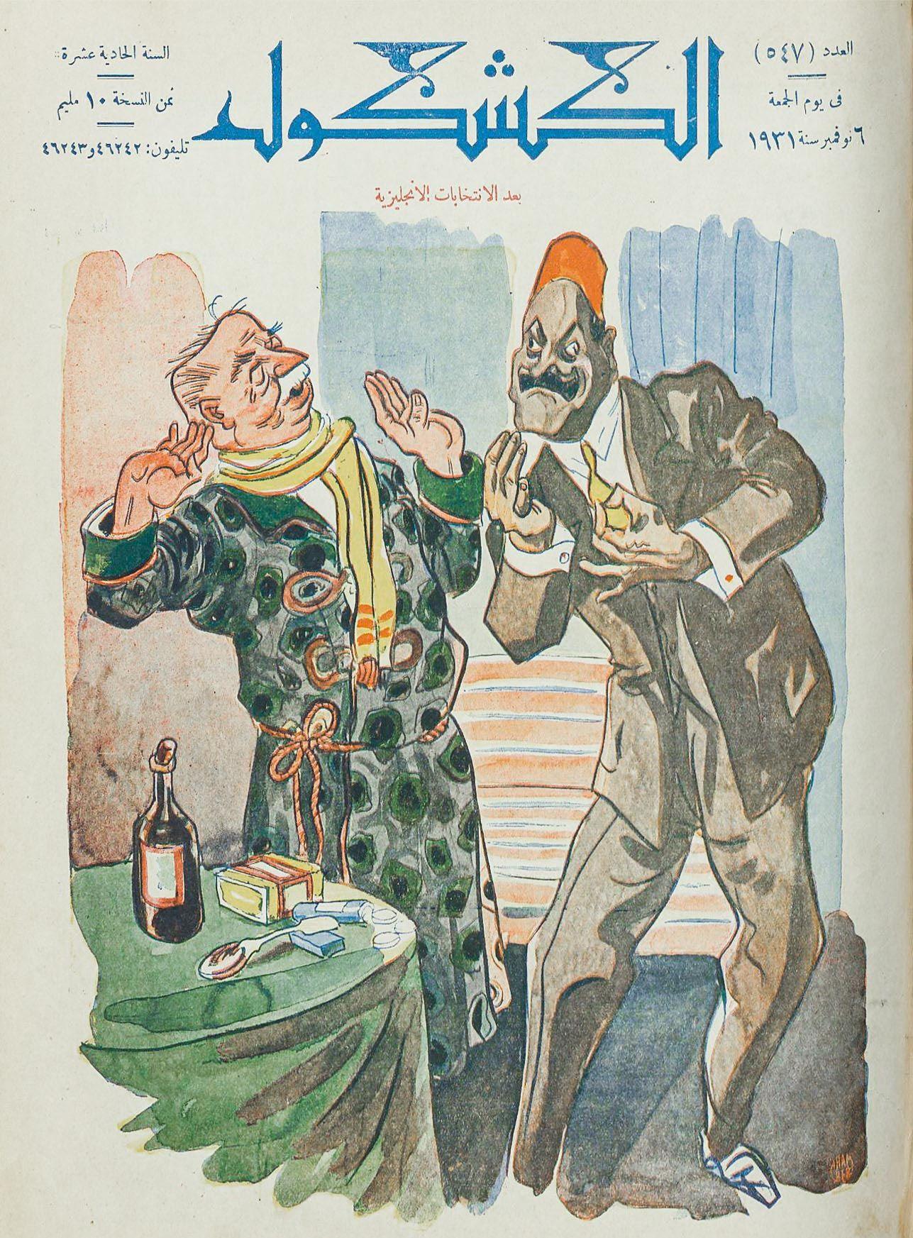
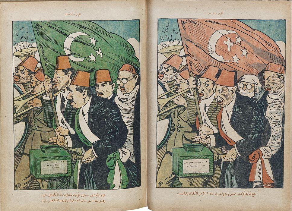
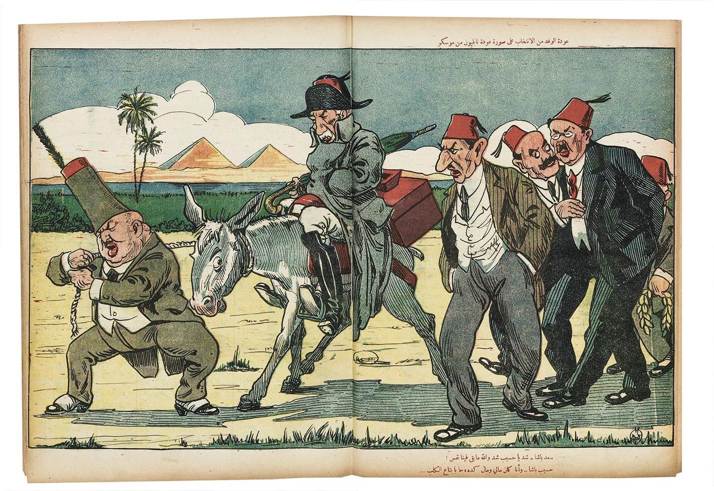
The publication, always rumored to be close to the Palace, kept a close eye on Zaghloul. Depictions of Zaghloul dominated the covers of Al Kachkoul from 1921 and until his death—taking numerous comical forms and appearing on roughly 250 of the magazine’s front covers. The depiction of Zaghloul thus became one of the main visual themes of the publication. Other satirical portrayals of political figures included Abd El-Aziz Basha Fahmy (ʻAbd al-ʻAzīz Fahmī), a lawyer, judge, poet and a prominent figure in the nationalist party; Huda Sha'arawi (Hudá Shaʻrāwī), the leading Egyptian feminist in the first half of the 20th century and founder of the Egyptian Feminist Union (1923); Zeiwar Basha (Zīwār Bāshā), two-time Prime Minister of Egypt, nationalist, and former president of the Senate; Hassan Hasseb Basha (Hasan Hasīb Bāshā), the Minister of Defense and Naval Forces in 1924; Edmund Allenby, British High Commissioner, and many others.
The journalistic make up: (ʻilm al-Dīn 1989) design and designers
When first launched, the initial large-format four-page folio ranged in size from 29.8 x 23 cm, to 36.3 x 25.7 cm, to 35 x 24.5 cm. When the number of pages increased, the dimensions changed, and it became slightly smaller. In general, and partially due to the nature of print production at the time, dimensions were not consistent throughout the issues and varied slightly from one issue to the other.
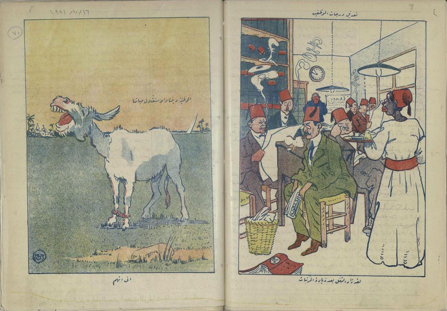
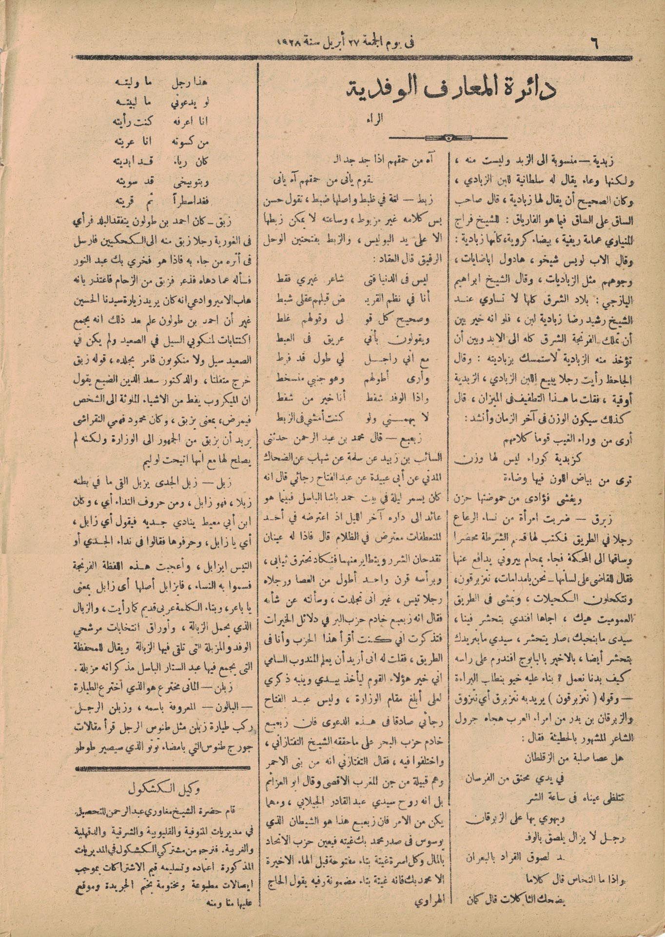
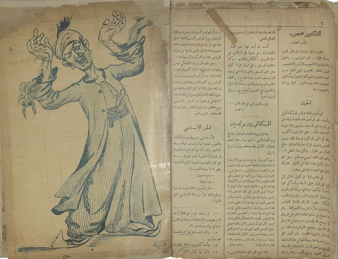
For most of its run, Al Kachkoul was printed on uncoated paper, except for a few issues that were printed on semi-coated paper. Its early illustrations were monotone, followed by three-color printing until finally developing full color prints. The masthead style, design, and typographic treatment of issue number, date, and headline changed numerous times. The black-and-white inside pages were composed of three columns, referred to as rivers (ʻilm al-Dīn 1989) by newspaper professionals at the time, including regular columns that were maintained throughout the publication’s existence.
Front and back covers
Logotype
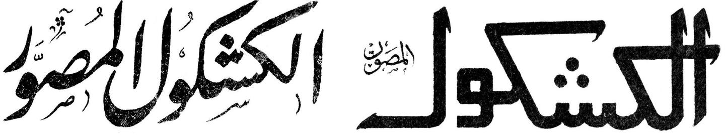
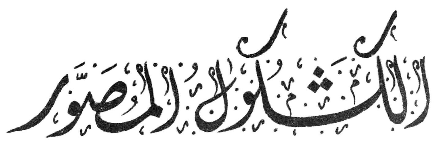
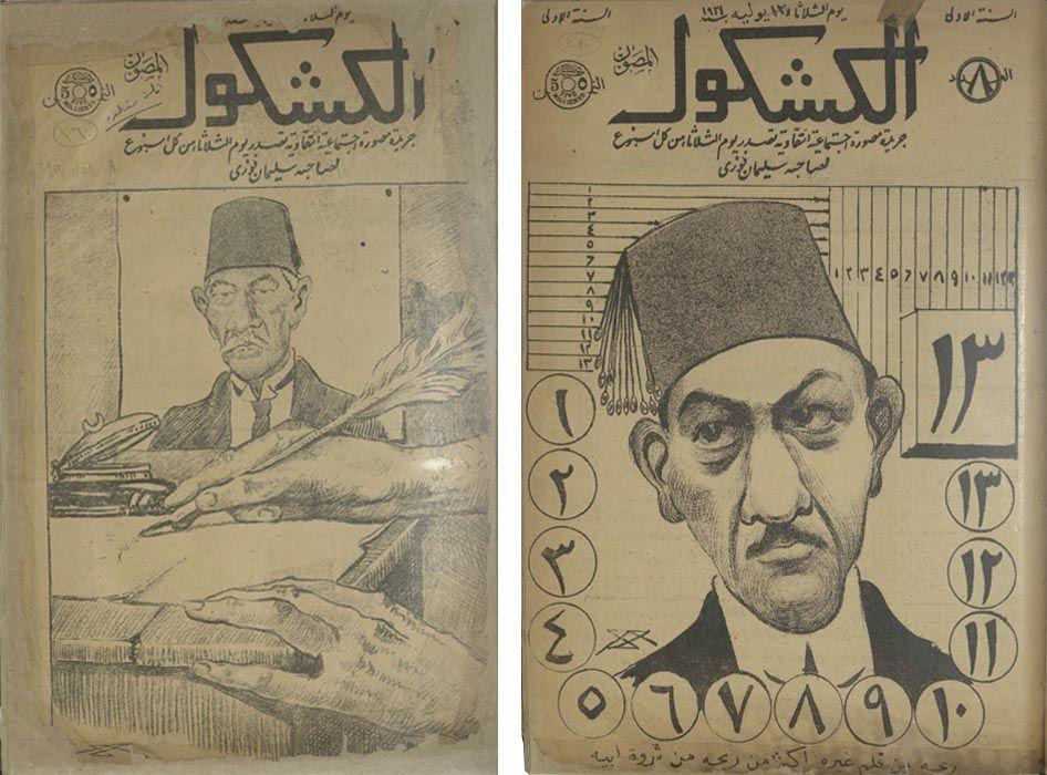
The magazine’s first logo was calligraphic, inspired by the Nastaliq script with Ruq'ah flourishes, but had already changed by the fifth issue into a simple modern treatment though with poor typographic anatomy, presumably drawn by a non-Arabic speaker or someone with little typographic skill. By issue 14, they went back to a decorative calligraphic form with diacritics, inspired by a Diwani script, a variety of Arabic script developed during the early Ottoman era.
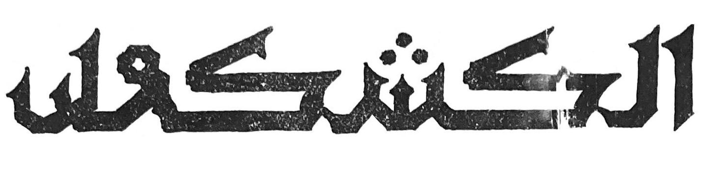
By issue 26, the masthead developed into a mono-linear hand-drawn logotype with no characters descending below the baseline, a feature unusual to Arabic calligraphy—except for gridded square Kufic. The form was simple, avoiding traditional calligraphic flourishes and employing a subtle geometric arc reminiscent of Fatimid Kufi style at the end of each stem. But the drawing seemed hesitant and uncertain.
Somewhere between issue 95 and issue 100, the publication’s logotype was condensed, and a slight modification was introduced by disconnecting the last two letters and changing the graphic nature of the diacritics of the letter “sheen”.
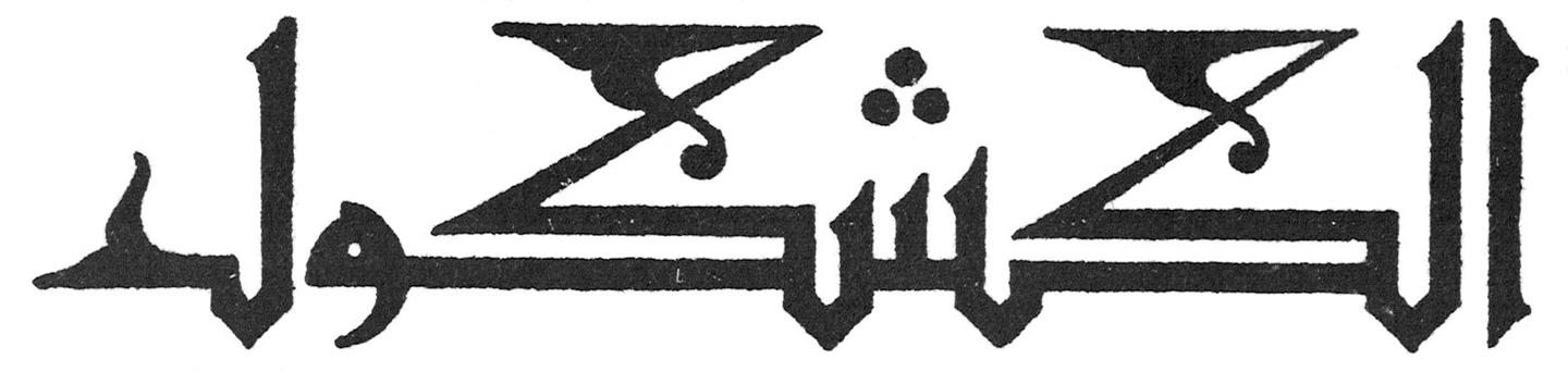
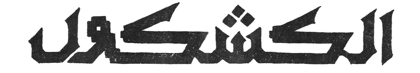
The logo changed for the last time in the middle of its seventh year, and a decorative late Kufic style was used as the basis for the new design. In a brief announcement published in the first issue of the same year, Al Kachkoul describes itself as a critical independent publication supporting the independence of the nation. “We do not need to renew the vows we took when we first published our first issue, independently, and to serve our nation, not to serve a specific party or a specific individual, we only say what we think and we depend on God solely, the God of the hearts and he who gives power.”1 This announcement, which emphasizes the issue of national sovereignty, suggests that the choice of using a classical form like Kufic style, a calligraphic style composed of geometrical forms and upright structure, the oldest form of Arabic calligraphic style that was first employed for Quranic manuscripts and later used for monumental and architectural ornamentation, fitted very well with the agenda of emphasizing local forms of the style, namely the Egyptian Fatimid Kufi.
Inside pages
“Al Kachkoul Printing Facilities. Stone and letter. The value of a newspaper or a book increases with the beauty of the printing and its quality as international magazines and valuable books have to possess a splendor that multiplies the desire for reading and this here Al Kachkoul printing facilities have the best printing equipment in both letter (moveable type) and stone and the color images of Al Kachkoul and the quality of its printing is a most sincere witness and for those who wish to print a book or a magazine they should come to the administration of this printing facility which it is perfectly ready for printing what lawyers and physicians and merchants need ranging from invoices and folders and to letters and business papers and tabled accounts.” 1925. Al Kachkoul, no. 399, page 19.
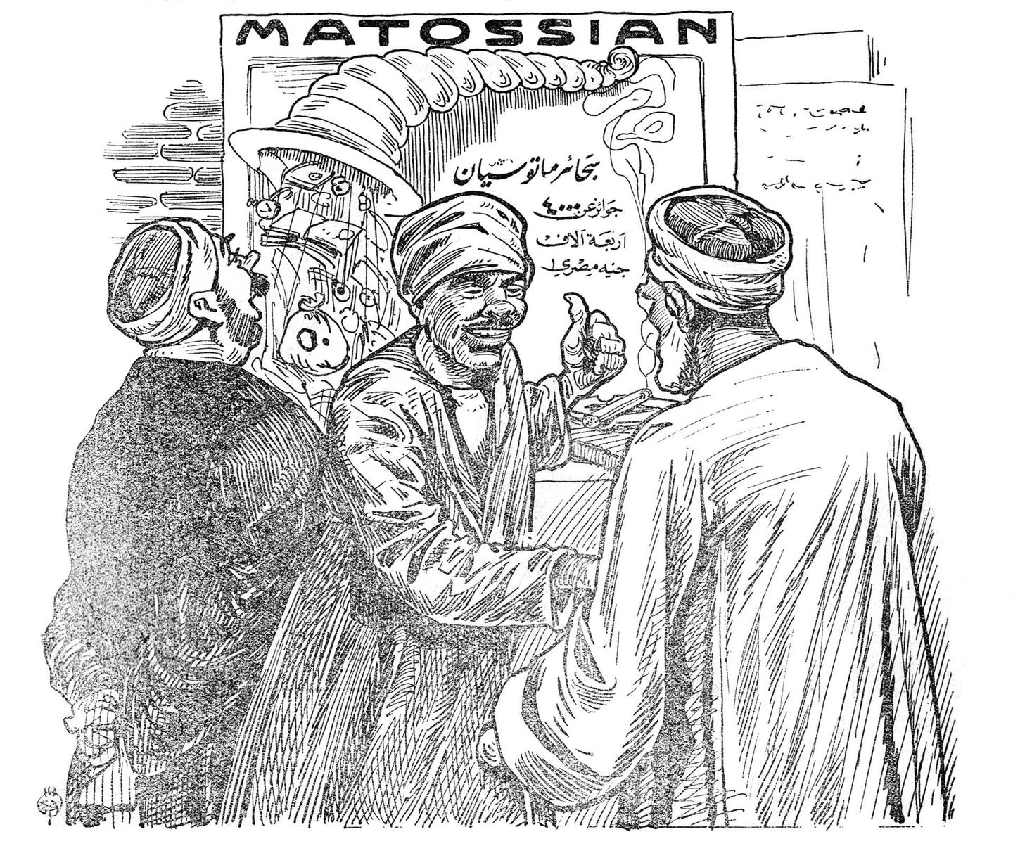
The continuous repetition of the above claims in different issues over the 13 years of the magazine’s existence, demonstrated how much design and printing were valued by the editors. The value of any publication was seen to increase with the quality of the printing. The printing facilities of Al Kachkoul were equipped with the most advanced movable type and stone lithography printing technology in Egypt at the time. They also offered printing services to commercial clients, which were advertised on their pages directly appealing to doctors, attorneys, and other professionals to use their facilities.
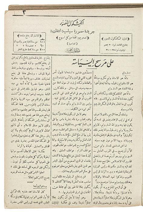
The magazine was divided into different fixed sections including “On the political stage,” “Eternal poetry,” “The Wafdist Lexicon,” and many others, set in the Naskh-style Amiri2 font designed at the beginning of the 20th century. The sections were laid out on a meticulously set three-column grid which could be merged into two columns when needed. When space was available and the text did not fully fill the printed page, advertisements were inserted to make use of that empty space; diverse in tone and content, these included advertising the magazine’s subscriptions agents in cities all over the country, physicians announcing their availability to the public, and occasionally auctions for farm animals and other goods. Because of how the textual content was laid out, there was an assumption that readers would read the printed words one by one, and would thus be able to separate between copy content and advertisements. The text was in great contrast to the bold clarity of the illustrations which were presumably meant to also attract the illiterate.
Illustrations
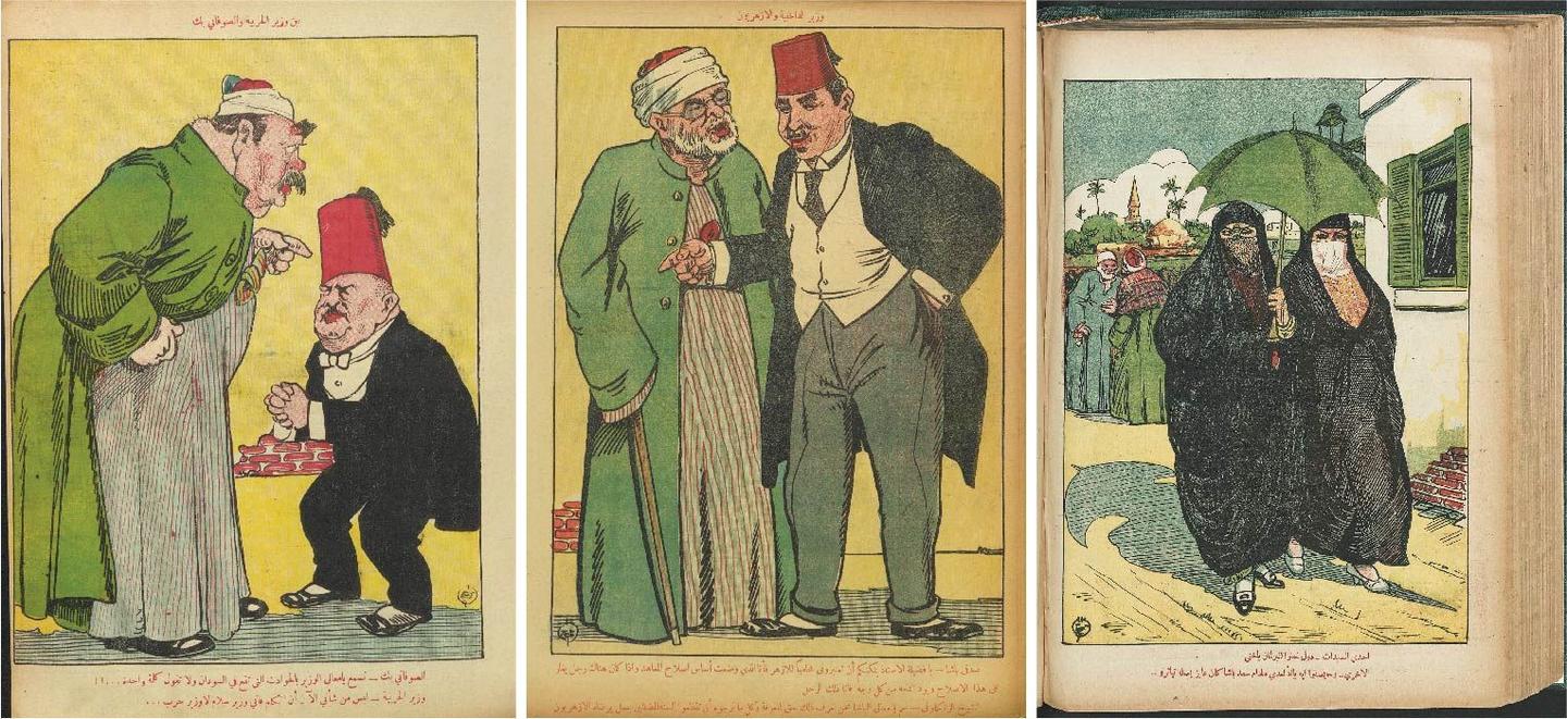
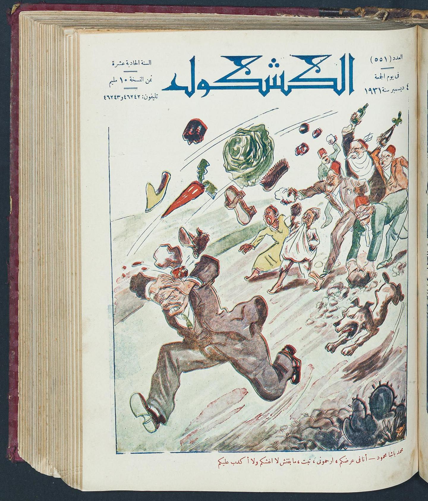
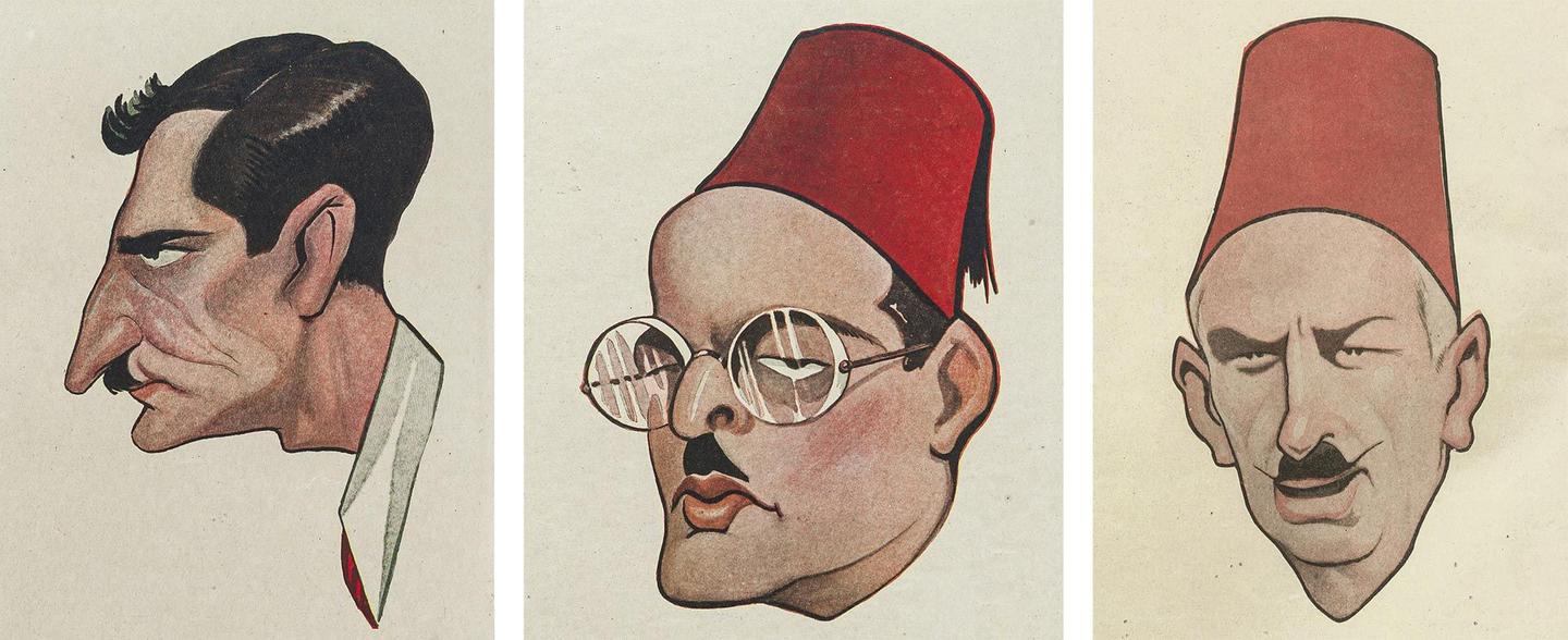
The magazine’s detailed illustrations portrayed and documented—often in a grotesque fashion—the characters that played a significant role in the Egyptian political scene until the early 30s. The publication used satire and caricature to critique political figures and their positions, it also used racially charged imagery when it came to representing Sudan, and negatively connotated sexist depictions that were used to critique certain politicians.
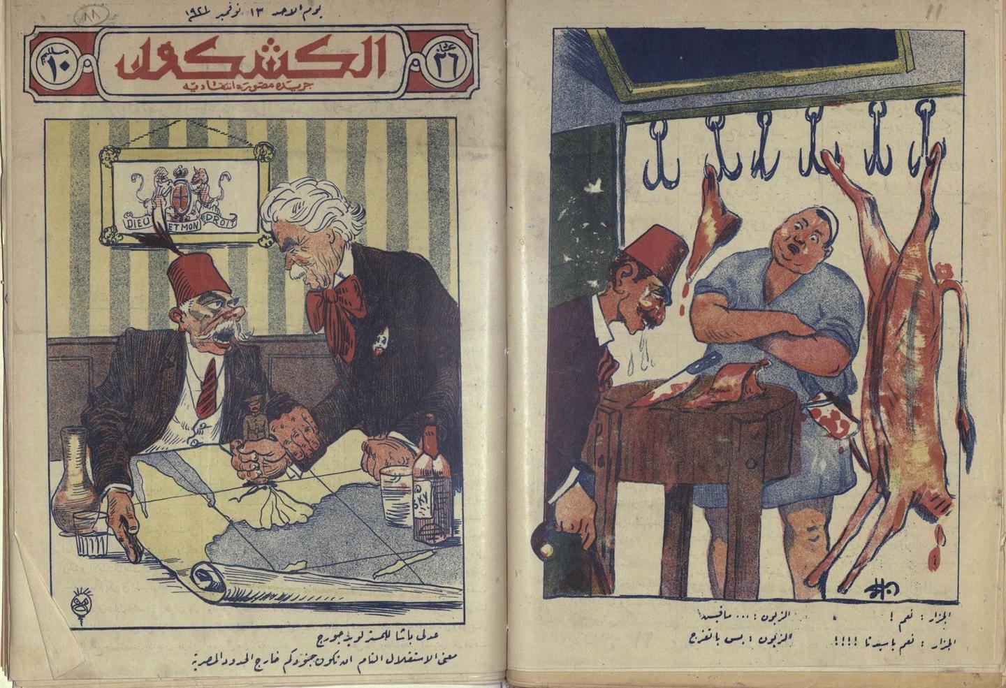
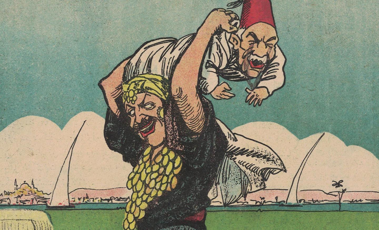
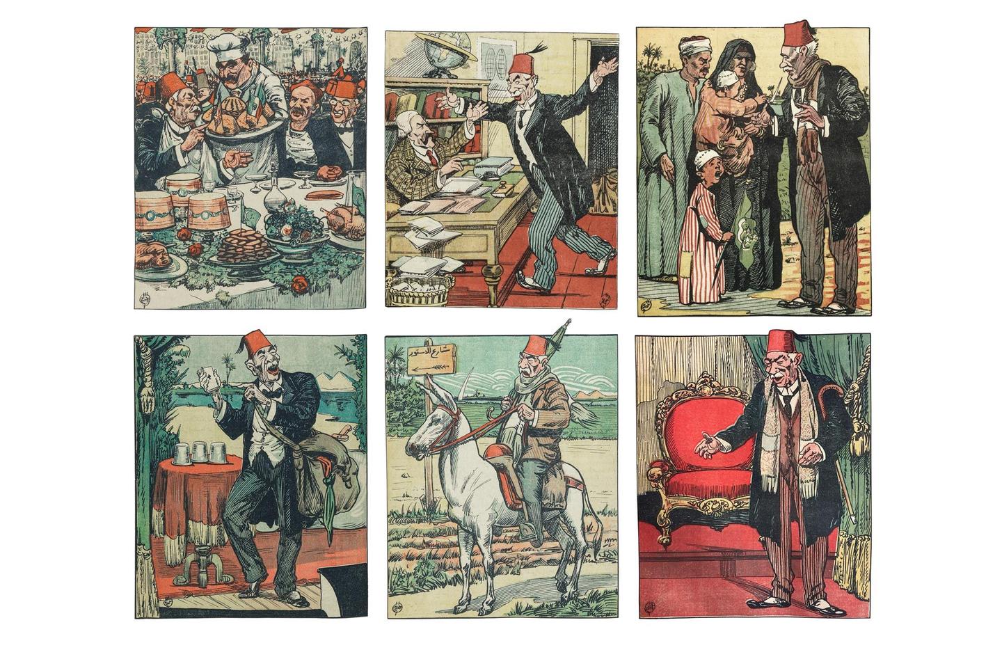
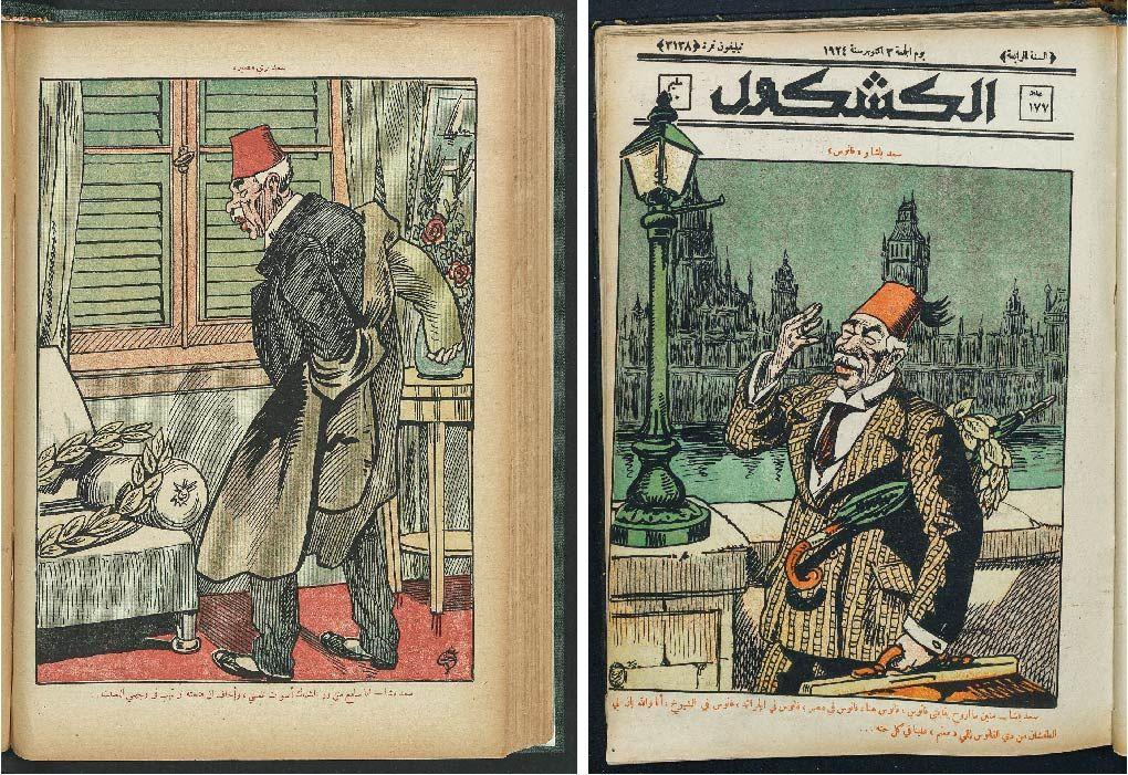
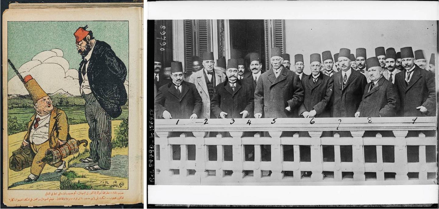
These illustrations, however, were rich, expressive, well produced, full of details in both background and foreground, and printed in a myriad of bright saturated inks including plenty of red—especially in the numerous drawings of the fez (also known as tarboosh or tarboush), a felt headdress in the shape of a short cylindrical truncated hat—yellow, blue, green, and black, along with tints that were produced using different styles of halftone patterns and color gradients.
The earliest illustrations were simple tinted monotone prints with wild theatrical brushstrokes and textures reminiscent of the drawings of Toulouse-Lautrec. At the time a number of illustrators worked in the publication; during its first year, at least three names appeared before Juan Sintès—the magazine’s most important illustrator, including an illustrator who signed using only the Arabic letter “Noon.”
From issue 14 in 1921 and until 1929, the publication was fully illustrated by Juan Sintès, a Spanish illustrator whose drawings were remarkably bright, layered, and lively. However, the content of these illustrations was—according to most sources—dictated by the owner and publisher of the magazine. Following Sintès’s departure, a rotating roster of illustrators worked in the publication including Egyptian artists who later on became quite prominent like Mahmoud Mokhtar (1891–1934), Mohamed Hassan, Mohamed Saeed Ziadah, Mohamed Fawzy, and Ahmed Sabry (1889–1955) who worked as illustrator with the Entomology Department of the Ministry of Agriculture then as an artist with the Ministry of Public Works, and was one of the teachers of Hussein Bicar (1913-2002) and the prominent Alexander Saroukhan (1898-1977), the Armenian-Egyptian cartoonist and one of the pioneering caricaturists in 20th-century Arabic press. Some of these illustrators also contributed to Fawzi’s Assaghr where they drew comics and advertisements.
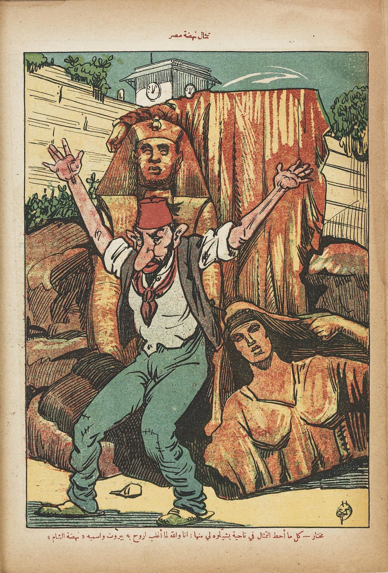
The illustrations relied on generally realistic depictions, with some minor to moderate exaggerations to create a symbolic language that sometimes leaned on allegory. A good example is this scene from issue 256, during the magazine’s fifth year, where one human body has three heads representing how the British High Commissioner saw the three main political parties (the Wafd Party, the Liberal Constitutional Party, and the National Egyptian Party) as one. Another recurring detail with symbolic meaning is that of exposed red bricks, a sign of poverty and falling into ruin, an image that was heavily repeated throughout the magazine’s existence.


Due to numerous financial struggles, in 1929 the magazine’s quality started gradually declining. This was first perceivable in the illustrations which became more schematic and less detailed, more like hastily drawn sketches with hesitant lines. A cheaper paper was used, and the print quality deteriorated, though in the magazine editorials these changes were disingenuously described as developments as the editors argued in a written announcement in issue 420 (1929), claiming developments in the quality of print, paper, and portraiture:
“Last year we were able to raise the quality of print, paper and photoengraving. Special attention was given to developing portrait caricatures– specifically of the greatest of men and functionaries. The number of pages was also increased. And despite the current political climate which makes finding the kind of material Al Kachkoul thrives on difficult, we will persevere in increasing our scope and editorial topics.”
The illustrator: Juan Sintès (1881–1945)
Juan Sintès was a Spanish illustrator who lived with his family in Paris before migrating to Egypt when he was invited to teach engraving at the Faculty of Fine Arts. He was skilled at drawing portraits and used solid black outlines, grotesque faces, and perspectives, as well as lively depictions of political situations, with attention to background details and great humor. At Al Kachkoul he illustrated the front and back covers and filled a full spread inside the publication, as well as occasionally contributing some black-and-white advertisements. Sintès drew expressive situations, and his drawings were full of movement and lively characters. He tended to use a widespread format of stone lithography which gave vivid colors to the prints. Sintès finally left his position at the publication in 1929 after a dispute with the magazine owner, and went on in 1931 to publish GOHA, where he was both illustrator and editor (a first at the time), though it was marred by a typographic weakness exemplified in the masthead with a Latin font that mimicked Arabic scripts. GOHA was published in French to explain to foreigners, both those living in Egypt and outside, the political situation in the country (Ellabbad 2003) and was generally pro-Wafd, possibly a compensation for the damage the illustrator caused while working for Al Kachkoul (ʻAbd al-Naʻīm 2016).
The caricatural portraits of Sintès were considered by many to be true works of art, to the point that they were admitted to the Cairo Salon in 1927, where Sintès’s exhibition of more than 300 drawings were hosted in a room which was fully dedicated to him (Radwan 2017). The early example below from issue 18 shows how Sintès playfully integrates his signature in the composition inside the shape of the moon. He mastered the Egyptian dialect and often wrote his own commentary to the illustrations.

Recurring iconography: a flag, Zaghloul, and racial depictions
Images of the nation: the flag
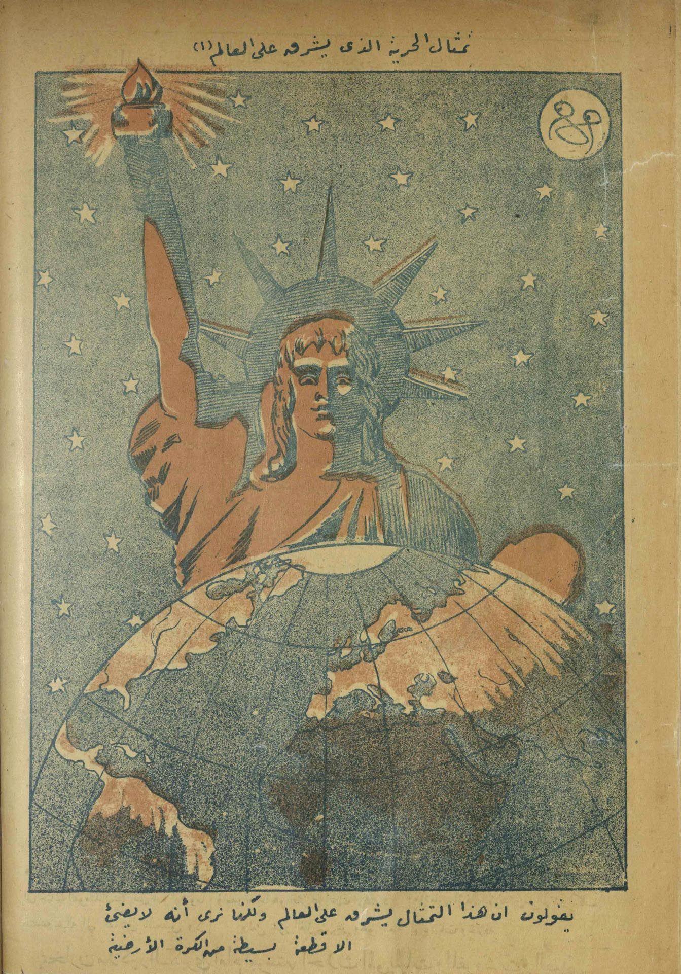
Al Kachkoul was interested in not just speaking about the nation but in actively constructing narratives about nationhood. The drawing of the flag made countless appearances in the illustrations and was always portrayed as an integral part of the landscape. The flag of the Kingdom of Egypt, used from 1923 until 1958 (by then Egypt had become a republic), took many forms, drawn as a dress worn by a woman symbolizing the nation, as a duvet comfortingly covering a sick woman in bed, wrapped around a watering can used to irrigate the land, and even worn as underclothing by a port-worker.
Images of Saad Zaghloul
Saad Zaghloul (1859–1927) was an Egyptian revolutionary and statesman. He led a civil disobedience campaign with the goal of achieving independence for Egypt (and Sudan) from British rule. Zaghloul played a key role in the Egyptian Revolution of 1919, as well as playing a role in prompting the British Unilateral Declaration of Egyptian Independence in 1922. Zaghloul also served as Prime Minister of Egypt from January to November 1924.
The Revolution of 1919 was a countrywide uprising against the British occupation of Egypt and Sudan. It involved Egyptians from all walks of life in the wake of the British-ordered exile of the revolutionary Egyptian Nationalist leader Saad Zaghlul and other members of the Wafd Party in 1919. The Revolution led to the United Kingdom's recognition of Egyptian independence in 1922 as the Kingdom of Egypt, and the implementation of a new constitution in 1923. The British government, however, refused to recognize full Egyptian sovereignty over Sudan, or to withdraw its forces from the Suez Canal Zone, factors that would continue to sour Anglo-Egyptian relations in the decades leading up to the Revolution of 1952.
Unlike Rose al-Yūsuf, a contemporaneous magazine, Al Kachkoul—rumored to be supported by the establishment—focused on criticizing Zaghloul and the nationalist Wafd Party, critically scrutinizing his character on different occasions.
In various issues, Zaghloul was shown wearing or holding a laurel wreath, a symbol of divinity or royal power in ancient Greek mythology; it also revealed the elevated status of victorious athletes at the Olympic Games. This idea was later adopted by the Romans to show the importance and godly status of their emperors. However, in the magazine’s depiction, the laurel is not on his head but is rather a superfluous neglected element: part of his wardrobe or a prop that he holds in his hand until needed, a depiction that suggests an opportunistic performer without trustworthy policies and beliefs.
Al Kachkoul, however, uses drawings of laurels on other political figures like Zeiwar Basha; Aly Maher (ʻAlī Māhir), minister of finance from 1928 to 1929 and Prime Minister sporadically between 1936 and 1952 on the cover of issues 219 and 255; and Zaghloul on specific occasions.

Nationalism and biases
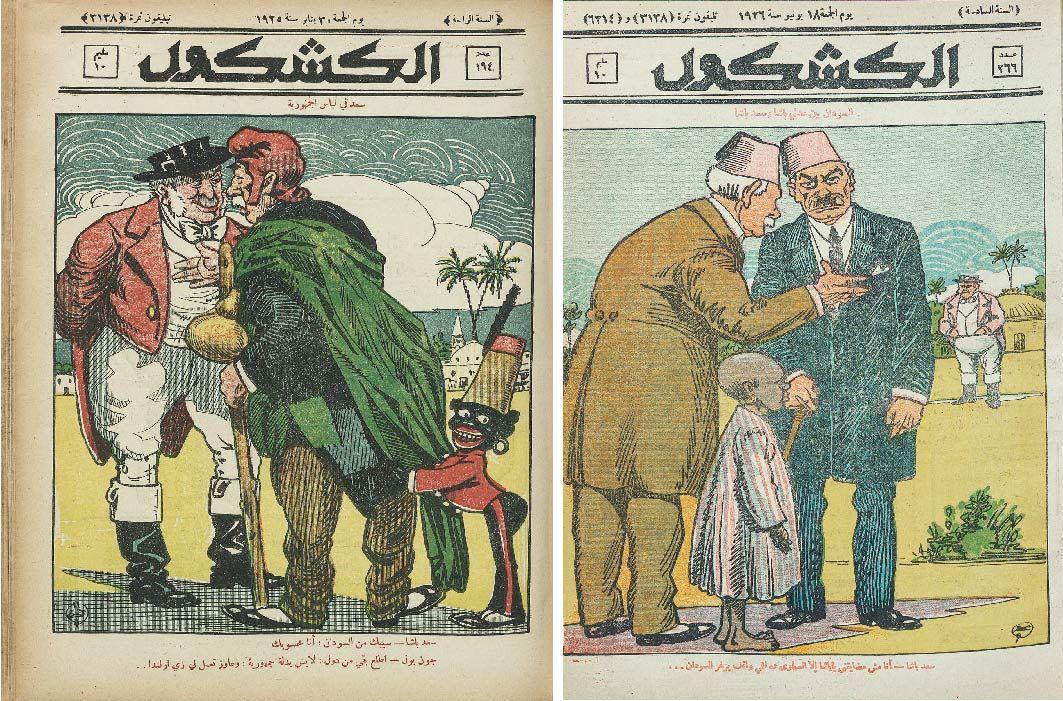
Throughout its existence, the publication used aggressive and demeaning tones in both copy and illustrations, together with the commentary that accompanied it. A chauvinistic sense of superiority permeated the content, especially when it came to matters related to Sudan which contained racist implications. The illustrators constantly portrayed Sudan as a grotesque and unsightly black woman, a barbaric and less Western-looking figure, an underprivileged child, and a constant burden to the Egyptian nation.
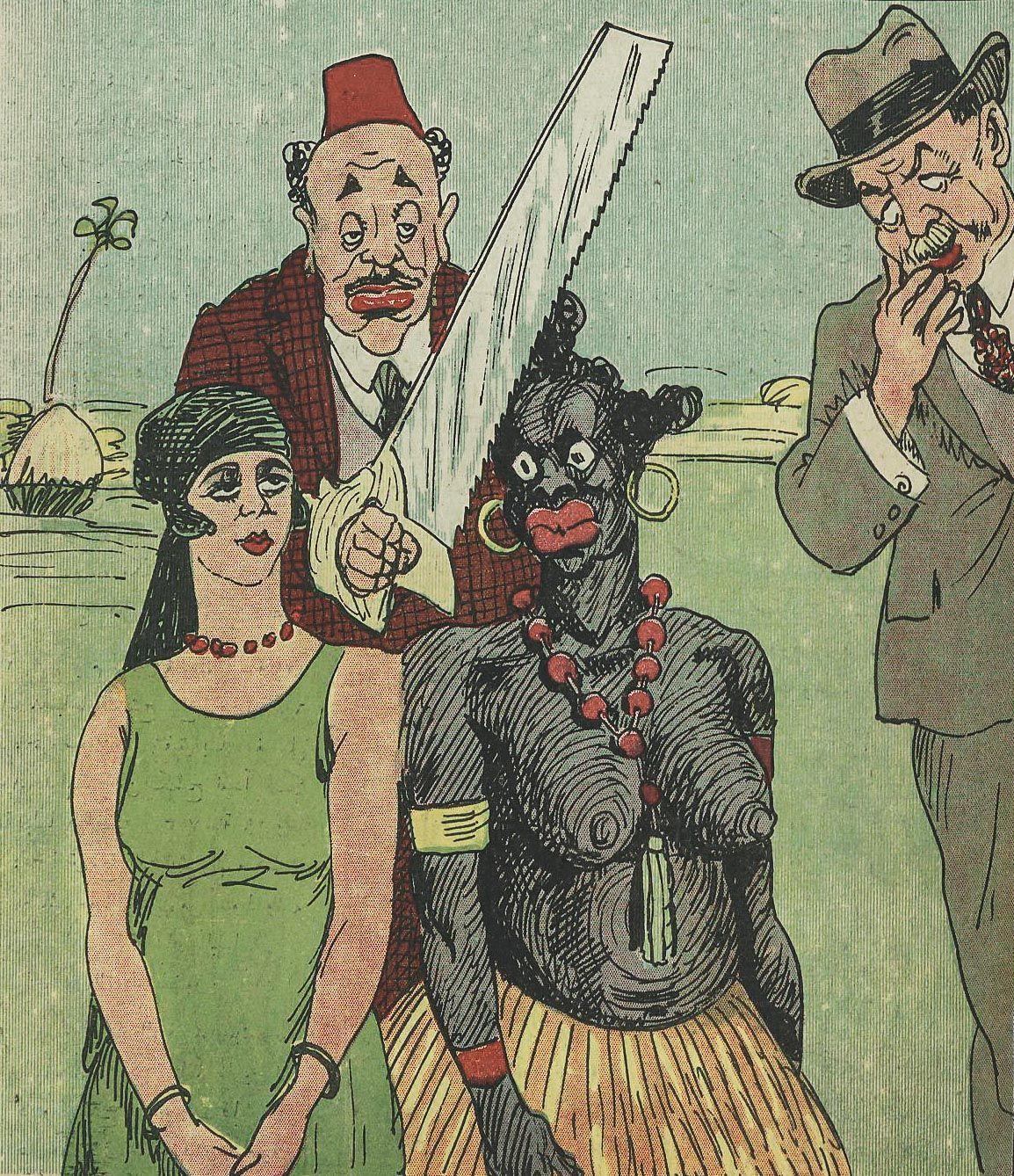
Other biases appeared throughout the publication. Male figures were humiliated by putting them in women’s stilettos. Physical traits such as being short were used to mock political figures, such as in the extensive portrayals of Haseeb Basha (Ḥasīb Bāshā), a noticeably shorter-than-average person and the minister of defense during Zaghloul’s tenure, who was drawn with a fez three times the average length to compensate for his lack of height.
Studying this publication and its historical and stylistic context gives a strong insight into the prevalent culture of the time, the economic and political conditions, and the aesthetic values of the region, specifically northeast Africa, during the 1920s. Tracing the progress of the visuals across over 600 issues published between the initiation and the closure of the publication uncovers biases rooted in the culture, as well as a strong artistic skill and stature among other nations. Though animosities and biases toward others were prevalent at the time, the intellectual community was open to outsiders of different nationalities, and ideas and skill sets were interwoven and helped shape the production of the dissemination of news.
Bibliography
- ʻAbd al-Naʻīm, Ahmad. 2016. Al Kachkoul: Tales from the Book of the Conditions of Egypt. Cairo, Egypt: Maktabat Jazīrat al-Ward.
- Abdel Naeem, Ahmed . 2023 Interview by Engy Aly.
- Dīn, Maḥmūd ʻilm al-. 1989. The Journalistic Make Up. Cairo, Egypt: Al Arabi Publishing & Distribution.
- Ellabbad, Mohieddine. 2003. Naẓar! 3. Vol. 3. Cairo, Egypt: Al Arabi Publishing and Distributing.
- internet archive. 2023. “Full Text of ‘Foreign Office: Confidential Print Egypt and the Sudan 1838-1956.’” Archive.org. 2023. https://archive.org/details/foreign-office-confidential-print-egypt-and-the-sudan
Footnotes
- 1My translation.
- 2A typeface designed by the Bulaq Press, also called al-Mataabi' al-Amiriya which inspired the name, in 1905. Amiri was famously used to print the Cairo edition, one of the first typographically composed printed editions of the Quran to be certified by an Islamic authority—Al-Azhar—in 1924. Khaled Hosny, "The Amiri typeface" (PDF), TUGboat 33 (2012): 12.